The company turned to us for a change in corporate identity after renaming the company from KP Immobilien to KP Solar Group. For the purposes of the new identity, a marketing and creative analysis was carried out, on the basis of which were created a new logo, slogan POWERING PROGRESS, full graphic standards, and a conceptual design for a website. With the implementation of the new brand identity, you can familiarize yourself with www.kpsolargroup.com


From an assignment by Fresh Radio Group for a banner ad project promoting RADIOcast, the task was supplemented by creating a logo for this popular Bulgarian podcast. The basic version of logo is designed as a combination of Cyrillic and Latin letters.
A special project to create the first logo of the Folk Music Orchestra of the Bulgarian National Radio. The project was combined with the orchestra's 70th anniversary and was a true inspiration for us, realized in just one week. The symbolism includes musical notes, a radio station, and Bulgarian embroidery. The project is free of charge for the orchestra.
An assignment from Gama Commerce LTD to update the logo of their main brand. The assignment was completed by creating a logo with new typography and a graphic element representing a palette, a range(gama) of paper products. A logo guideline package was also developed for the project. The next projects were a series of packaging under the new visual brand.
These two logos were created for the American company Proper Health Supplements PLTD, which operates in the United States. Dr. Oscar is a logo designed for a brand of pet supplements. Dr. MaxWell is a brand of human supplements. Both brands rely on the suggestion of medical expertise and purity of the products.
The Baby Gear Bear logo was created for a branded online store offering baby strollers and other baby and toddler care products. The logo features the recognizable symbol of a beloved child's bear.
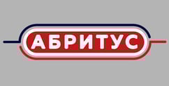
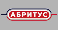
This logo of the CLIO brand fully fulfills the assignment of a large Bulgarian manufacturer and distributor CLIO COMMERCE and presents the vision of a brand of food products in the middle price category. The project also adheres to graphic standards and corporate identity. For the same client, a second brand with logo Abritus was created, working in the same category.
The Forte Fresco logo was created for a brand with products for the European market. The product category includes snacks and quick meals with healthy recipes. The logo represents the idea of a quick, but also healthy meal.
Alakar is a unique name and logo specially created by order of Quadrant Beverages AD, the company representing PEPSI in Bulgaria. The logo and graphic standards are intended to announce the special delivery of the fast food chain Aladin. The logo combines the idea of Aladdin's shoes borrowed from Eastern culture and the idea of fast mobile delivery. The logo awaits implementation in Aladin's services.
Custom logo REZONA for a real estate company. The company was created with the aim of offering highly valued and luxurious properties to the market, as well as investment packages. The project also adheres to graphic standards and corporate materials.
The brand BLACK SEA HOTEL approached us to enhance its visual identity. After a creative analysis, we developed a concept reflecting the unique character of the Bulgarian Black Sea coast, including a new logo, visual language, graphic standards, and corporate identity design to convey the hotel’s atmosphere, comfort, and premium service.
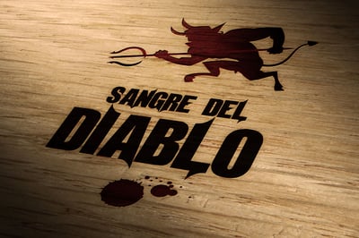
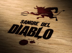
Sangre del Diablo or Devil's Blood is a private label wine from a Spanish winery. The logo and mascot were developed to represent this aromatic yet bold tasting brand. The vision is modern and memorable.